You have to hand it to Google. They know that I prefer Apple products and have been generally critical of many Google moves in the past couple of years. And yet, they’re unafraid to give me their newest products to test out. To be honest, I’m not sure Apple would do the same. But I think this is a smart move on Google’s part. On one hand, they may get a negative review but they know that many will discount the negativity coming from me. On the flip side, if it’s positive: gravy train time.
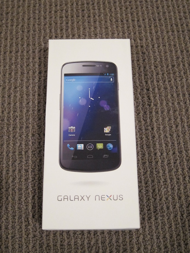
Thus: my thoughts on the Galaxy Nexus. But before I begin…
Rather than do a full-on review — you’ve probably already seen plenty of those — and given that I now write an Apple-centric column for TechCrunch, I figured it was the perfect opportunity to continue my “An iPhone Lover’s Take…” series. For some background, here are my previous stories from the same angle on the Nexus One, the HTC EVO 4G, the Nexus S, a Windows Phone, and even the iPhone 4.
My colleague Jason Kincaid took a similar approach for a post a few weeks back, but did it from a slightly different angle — call it: An Original iPhone Lover Who Learned To Love Android Until Switching Back To The iPhone… Reviews The Galaxy Nexus. Oddly, he just had just switched back to the iPhone after years of Android use — but he says the Galaxy Nexus and Ice Cream Sandwich in particular may get him to switch back yet again. Meanwhile, GigaOm’s Darrell Etherington also looked at the Galaxy Nexus from an iPhone user’s perspective and ultimately decided the iPhone 4S was still the device for him. So I’m here to break the tie.
I’ve been using an iPhone since the day the first one launched in 2007. It is without question my favorite and most-used gadget of all time. Over that same span, I’ve tried about a dozen different Android devices ranging from the G1 to the Nexus S — the results have been decidedly mixed. I pretty much hated the G1, generally liked the Nexus One, thought the EVO 4G was more or less crap, and basically enjoyed the Nexus S. But none, in my mind, could touch the iPhone.
So what about the Galaxy Nexus?
I was given the device shortly before I took off for Europe a couple weeks ago. Given that it’s unlocked and I got a 3G SIM, I’ve been using it a lot — just as much as I’ve used any of the other Android devices listed above. For a few nights, it has been my primary device when I’ve been out and about. Unfortunately, I have not been able to test any sort of 4G network with it, so consider all of this a Galaxy Nexus 3G review.
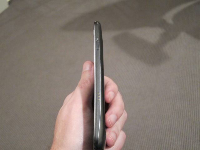
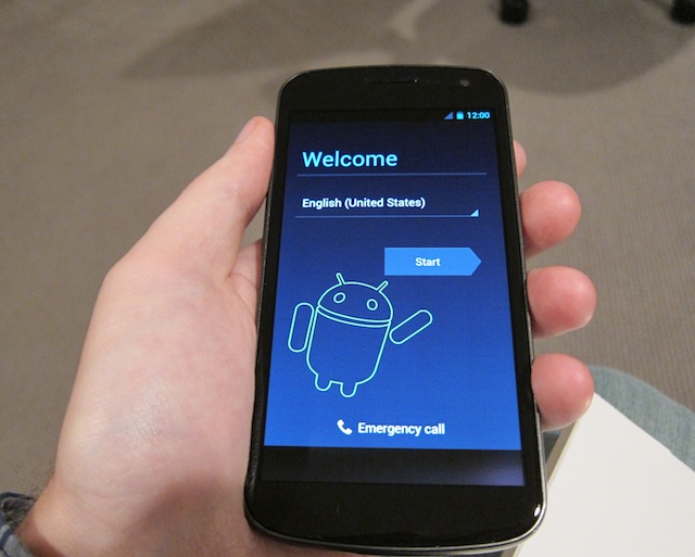
First and foremost, the Galaxy Nexus is way too big. The 4.65-inch screen is nice when I’m sitting on my couch, but out and about it feels like I’m Zack Morris holding his Gordon Gekko phone. I’d consider myself to have average sized hands for an adult male, and the screen is so large that it killed several one-handed operations for me (especially since many Android apps use a top nav system). I’ll admit that for some apps, like Gmail, having a screen larger than the iPhone’s 3.5-inch variety is very nice. But 4.3-inch may be better. This is just too big.
While the screen is too big, I am happy that Google has finally decided to get rid of hardware menu buttons and go all-in on the screen. Previous Android hardware was always made worse by the decision to include fixed nav buttons along the button. With Ice Cream Sandwich, all these buttons can now be software-based. There isn’t even a home hardware button like the iPhone has anymore — it’s all software.
I like this. The iPhone home button wears down over time and it makes noise when you click it. (Of course, the Galaxy Nexus still has a wake/power button of the right side.) I hope Apple does something more inventive with the button if they choose to keep it in future iPhone hardware iterations. Perhaps a multi-touch top on the button that allows you to swipe between open iOS apps would make the continuation of the physical button worth it.

I also like the inclusion of an indicator light on the Galaxy Nexus. Both the Galaxy Nexus and iPhone have options to vibrate or give you audio cues to alert you to new messages, but if the phone isn’t on me, I often miss those. The light allows you to see if you have new message waiting without having to turn the screen on. This is one of the few things BlackBerry got right that Apple for whatever reason hasn’t bothered to mimic.
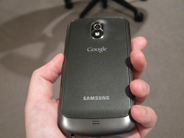
The rest of the Galaxy Nexus hardware leaves something to be desired. The iPhone feels like a completely and thoughtfully designed object. By comparison, the Galaxy Nexus still feels rather cheap and plastic-y. It’s not awful, but you’d think Samsung could do better at this point. Some people will like having the option to remove to the back to get at the battery, but the method for doing so remains a joke. You essentially have to rip it off. I feel like I’m peeling a nail away from a finger every time I do it — it’s that unpleasant.
The battery life itself on the device is very good. I felt like the Galaxy Nexus was lasting at least as long as the iPhone 4S on a fully charged battery, perhaps even a bit longer if some cases. Again, I didn’t try it on a 4G network, which is known to drain battery quicker. (I also haven’t had the battery discharge issues that some iPhone 4S users have been reporting since the launch.) But fear not, this is not the EVO with its temper-melting 30-minute battery.
The camera on the Galaxy Nexus is definitely worse than the iPhone 4S, both in megapixels (8 vs. 5), and in image quality. But the iPhone 4S is also a ridiculously good camera. The Galaxy Nexus is still a fine point-and-shoot replacement, in my opinion. The camera seems better than any other Android device I’ve used. One nit is that while there is a method to go right into the camera from the lock screen (just like iOS 5 has), it’s too slow if the camera isn’t previously running. You’ll hit the camera button and watch as the Android main screen loads and then the camera apps loads. This feels like more of a macro than a feature.
And let’s talk about Ice Cream Sandwich. The artist also known as Android 4.0 is very solid. There is no question that the software is much improved over previous iterations in terms of speed, but mainly usability. I really like things like the multi-task tray and some of the new widgets.
Unfortunately, the system still lacks much of the fine polish that iOS users enjoy. The majority of Android users will probably think such criticism is bullshit, but that has always been the case. I imagine it’s probably hard for a Mercedes owner to describe to a Honda owner how attention to detail makes their driving experience better when both machines get them from point A to point B. As a Honda owner myself, I’m not sure I would buy it — I’d have to experience it to understand it, I imagine. And most Android lovers are not going to spend enough time with iOS to fully appreciate the differences.
Still, if the Android team ever wants to convert (or at least convince) most iOS users, they still have quite a bit of work to do here. Then again, they probably don’t (or shouldn’t) care too much about converting iOS users over to Android. All the non-smartphone users out there remain the much bigger prize to go after (for both Google and Apple).
Other things that will sound like nits but drove me crazy with ICS included the constant focusing on text fields only to have to click again to get the keyboard to pop up. If I’m in a text field, I clearly want to type something. Why should I have to click again? This doesn’t always happen, but it happens a lot — particularly in third-party apps.
Another: why is there a separate app for Messaging and Google+ Messenger? Apple baked iMessage into their SMS app, why didn’t Google? If they’re worried about anti-competitive concerns, why would they bundle all the Google+ stuff into ICS to begin with? Similarly, why do Gmail and Email continue to be two separate apps? And why on Earth is the web browser not Chrome yet!?
The new People app social unification is nice — I love the big pictures. But my god Google needs help with their duplication/merging detection. One of my friends has four separate entries — one for his phone number, one for his Gmail/Google+, one for Twitter, and one for another email. Several others had three different entries. Most had at least two. Also, Google provides an option to link your Facebook account in Accounts & sync, but it does nothing. I’m sure this is due to the Google/Facebook fracas, but why include something in your OS that is completely broken?
Ice Cream Sandwich’s voice command functionality is a joke compared to Siri — but that may be changing soon, we’ll see.
In his write-up, Jason noted that iOS is still far behind Android when it comes to notifications, I have to disagree. I find Android’s notification tray to be far less useful than it is on iOS. For example, if I get three new emails, with Android, I just see that I have three new emails all grouped together. With iOS I can see at least some of the context. Same with Tweets. The size of the alerts in this tray also isn’t uniform in Android, so Facebook alerts seem more important with their huge logo.
I do like the ability to “clear all” in Android’s notification tray though. The iOS micro clear button remains a joke that badly needs to be fixed.
When it comes to web browsers, arguably the most important feature on any of these devices, there is no question that iOS still has a big edge here. I’ve seen arguments on both sides for why one is faster than the other — most recently, data today favors iOS — but just doing a simple use case test, mobile Safari kicks the ass of Google’s don’t-call-it-Chrome mobile web browser across the board. Some pages still refuse to render correctly on Android’s browser. And the ones that do cannot seem to get the simplest feature right: double-tap to zoom. You do it on Android and there’s a good chance you could end up looking at the middle of a random paragraph.
You’ll also still see a bit of lag in ICS when you do seemingly simple things like this. It’s still not as smooth as it should be. For the most part, ICS fixes many of Android’s performance issues, but there are plenty of times that you’ll still see stutters here and there.

And then there are the apps.
To be fair to Google, Ice Cream Sandwich is currently only on the Galaxy Nexus and it still hasn’t even officially launched in the U.S. But there’s a lot of work to do here. One app that I had on my Nexus S constantly crashes now on the Galaxy Nexus. And rather than quietly closing in the background, I get a nice big Windows-style pop-up that it has stopped running. Many other apps look fairly bad on the larger screen simply because they’re not optimized for it — again, something a wider release of ICS will hopefully fix.
The main problem I have with Android apps on the Galaxy Nexus/ICS remains the ones that are also available on iOS. When the apps exist on both platforms, it’s easy to compare them and the iOS version almost always wins — and often by a landslide. Take the latest version of Twitter, for example. It was just updated to run on both. On iOS it’s smooth, on ICS, there is noticeable stutter when scrolling. It’s much worse on Facebook Messenger and Facebook itself — no big deal, only the biggest app on both platforms.
The reason for the app differences between the two platforms remains a hot topic of debate. Again, all I know is what I see: app to app, iOS still easily beats Android in most cases. One counter-example, which I talked about on stage at LeWeb last week, is SoundTracking. I actually think their app is better on Android. But that has less to do with performance, and more to do with the fact that it can access hooks that iOS doesn’t offer, like background Spotify integration. Android developers should focus more on these benefits of Android and less on making their apps exact ports of their iOS ones. Something always seems to get lost in translation — often badly lost.
Now it just sounds like I’m focusing on the negative. It’s important to emphasize the fact that the Galaxy Nexus is without a doubt the best phone I’ve ever used that’s not an iPhone. And there is no question that it does certain things better than an iPhone — namely all of the Google apps and any third-party background/OS integration beyond Twitter, which is now baked into iOS 5. Google has also managed to just about match Apple in app quantity. This is all good — competition is good.
The next step that Google needs to take (or to help third party developers take) involves around app quality. Put simply: they need to create better tools for developers to use in order to take advantage of the strengths ICS offers. This won’t happen in 6 months, but it can happen if Google works at it.
After that, it’s the intangibles where iOS holds the huge advantage. And just like in sports, it’s not clear how well you can “teach” those. At some point, Google may simply have to acknowledge that iOS looks and feels better than Android because Apple’s entire fabric is woven with design, tight integration, and attention to detail. Google’s strengths are elsewhere; they should embrace that.
Google has done some very nice work here. Both the Galaxy Nexus and Ice Cream Sandwich are a new pinnacle of the Android platform. But in the end, it still comes down to something very simple: which device do I want to use day-to-day? Which phone do I reach for when I’m not doing a review? It’s still the iPhone. Without question.
Keep at it, Google.

Original link : http://techcrunch.com/2011/12/14/iphone-galaxy-nexus-review/
